What 40% latency looks like when a bank is your customer
I used to think performance work was a little less romantic than model work.
No shiny demos. No dramatic architecture diagrams. Just timings, traces, bottlenecks, and the slow discipline of asking where the system is wasting the user's patience.
Then I joined a customer call where a bank team uploaded documents live and waited for our OCR pipeline to return results.
Nobody said anything for the first couple of seconds. Then someone on the call, maybe joking, started counting under their breath.
One. Two. Three.
By the time the output landed, the number itself was not catastrophic. But the feeling was. You could sense trust thinning in real time. Not because the product was broken, but because the delay had created a tiny silence large enough for doubt to enter.
That was the day latency stopped being a secondary metric for me.
Back at my desk, the work looked unglamorous. Profile the preprocessing. Inspect memory transfers. Revisit dynamic resizing rules. Reduce waste in the decoder loop. Move pieces into TensorRT where it made sense. Be suspicious of every step that felt small enough to ignore.
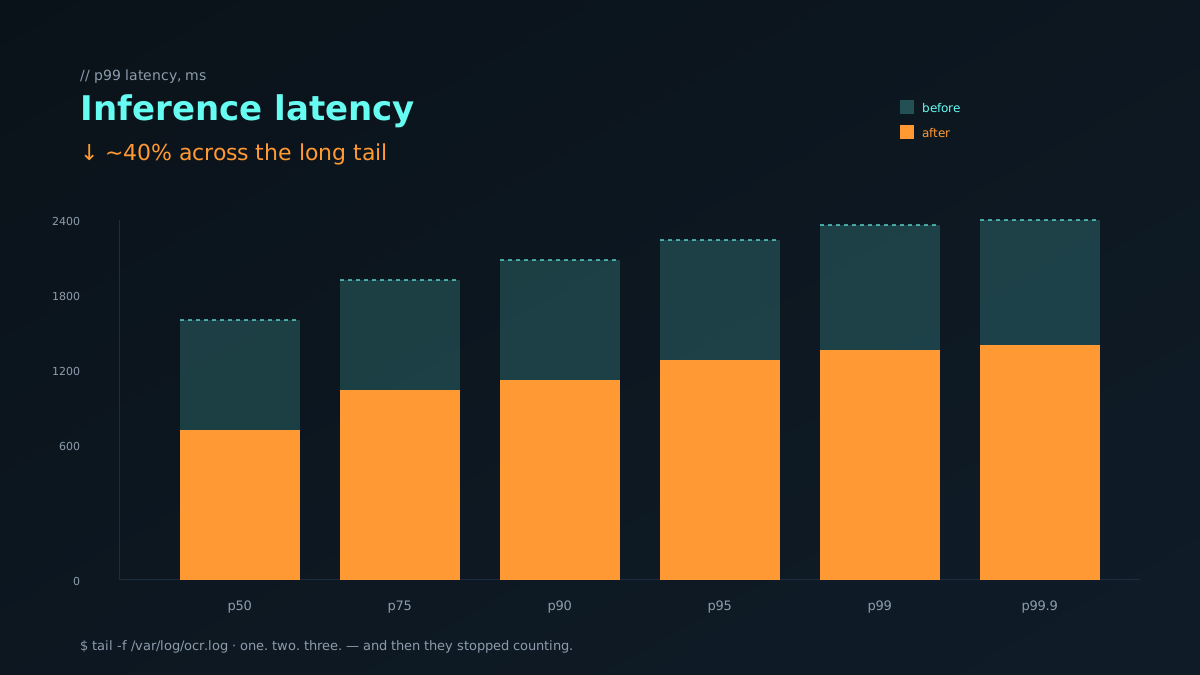
The strange thing about a 40 percent latency improvement is that it almost never arrives as one heroic fix.
It arrives as a pile of annoyances you finally respect.
A resize policy that is too conservative. A postprocessing step that keeps allocating what it could reuse. A beam-search branch that should not exist for certain classes of documents. CPU work pretending it has to be on the critical path. The system reveals itself in fragments, and your job is to keep caring long enough for the fragments to align.
There were nights when I felt less like an engineer and more like a mechanic listening for a sound nobody else could hear. The logs would look normal. The average numbers would look acceptable. But the long tail told the real story. The edge devices. The oversized scans. The bursts of requests when several users hit the service at once. That is where the customer actually lives.
Enterprise AI changes your relationship to waiting.
If you are building for yourself, a few extra seconds can feel forgivable. If you are building for a bank, those seconds become operational texture. They shape whether staff trust the tool enough to keep it in the loop. They shape whether a pilot becomes a rollout or a polite email about postponing next steps.
When we finally got the pipeline down by roughly forty percent, nobody on the team celebrated in a cinematic way. There was no grand speech. Just a quieter kind of relief. The product felt less heavy in the hand. The same workflow suddenly had better manners.
That is what good performance work does. It gives the product better manners.
People rarely thank you for a tighter decoder loop or a cleaner inference path. They just stop noticing the friction. They breathe normally through the workflow. Meetings get less defensive. Confidence returns without introducing itself.
I still love the model side of AI. I probably always will. But production has taught me that speed is not vanity when someone else has to live inside your system.
Performance is just empathy with a stopwatch.
Why averages lie
If you only watch the mean, you will gaslight yourself for months. The mean is the polite friend who tells you the party is going fine while three people are quietly leaving. Dean and Barroso said it cleanly in *The Tail at Scale*: in any system that fans out work or stitches together more than one component, the slowest tail dominates the user-visible experience [1]. A request that touches five subsystems with a 1% chance of being slow each is, in practice, often slow.
In our pipeline this showed up as a kind, lying dashboard. The mean said 1.4 seconds. The median agreed. The p95 was already raising an eyebrow. The p99 was where the bank lived — past three seconds, sometimes past five, and exactly where someone on the call started counting under their breath.
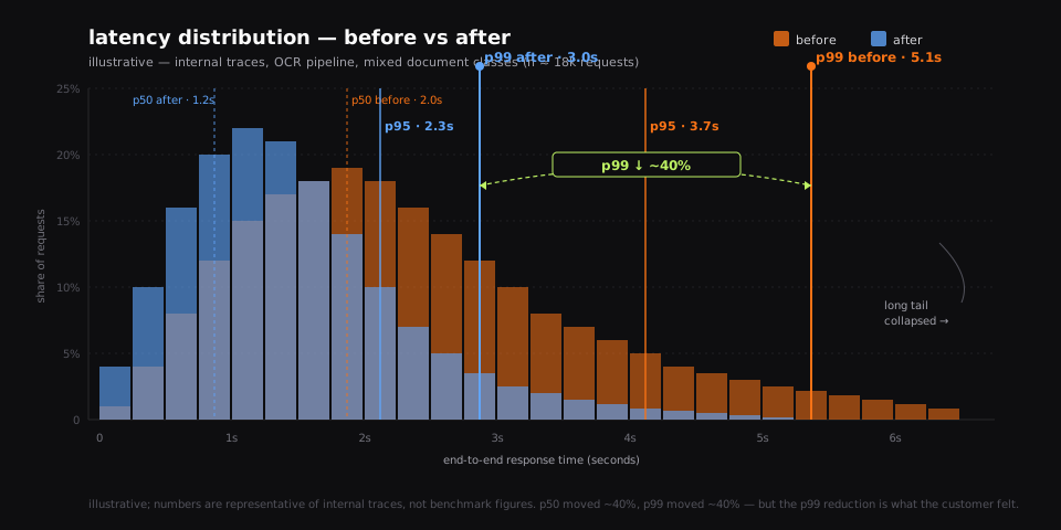
Look at the distribution and the story is no longer about averages. It is about a fat orange tail crawling toward the right edge of the plot. After the work, the median moved a little. The tail moved a lot. That is the shape of a real performance win — and the shape that user trust actually responds to.
What we actually changed (in order of pain)
There was no single hero commit. We just went down the flame graph and refused to be embarrassed about how small each fix was. The discipline came straight out of Brendan Gregg's playbook: profile honestly, write down what you measured, and never trust a hunch over a stack [2].
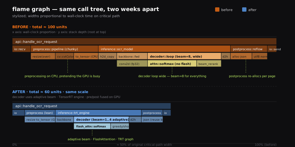
In rough order:
- **Preprocessing on the wrong device.** Resize and color conversion were running on the CPU while the GPU sat polite and idle. Moving them to GPU kernels collapsed an entire row of the flame graph and cut a noticeable slice off p50 as a side effect. - **A resize policy that thought every document was a 4K scan.** The rule was conservative, written for the worst case, applied to everyone. We added a cheap classifier and let small images stay small. - **A decoder loop that beam-searched everything.** Most invoices are not poetry. We made beam width adaptive — greedy or beam=2 for the easy classes, beam=4 only when the model's confidence dipped. This is the standard advice in TensorRT-LLM's performance guide [3], and once you do it once you can never unsee how often beams are wasted. - **An attention block that ignored memory layout.** Swapping in a FlashAttention kernel [4] gave us another quiet win — not because the FLOPs changed, but because the IO did. The GPU stopped waiting on its own memory. - **A second model we did not need.** A reranker that earned its keep on hard documents was running on every document. We distilled the parts we still wanted into a smaller head [5], which removed an entire forward pass from the critical path. - **Postprocessing that re-allocated the world.** JSON building, UTF-8 normalization, table reflow — every step quietly newing a buffer. Re-using a pool removed an embarrassing amount of time we had been paying in malloc. - **A graph that was not a graph.** We exported the stable parts to ONNX and ran them through ONNX Runtime [6], then promoted the hot path into a TensorRT engine [3]. The kernels were the same kernels. The scheduling was finally honest.
None of these are clever. All of them were waiting in the profile.
The Doherty threshold and why 400ms keeps showing up
In 1982, IBM researchers Doherty and Thadhani published a quiet, devastating finding: when a system responds in under 400 milliseconds, the human at the keyboard moves into a different mode — they think faster, they explore more, they make more decisions per minute [7]. Past 400ms, productivity drops, and the drop is not linear. It is a cliff.
We were not going to hit 400ms on a multi-page bank document. Nobody is. But the threshold still mattered, because the same shape repeats at higher scales: there are response times where conversation continues, and response times where conversation stops. On a sales call, that second cliff lives somewhere between two and three seconds. Past it, somebody on the line will start counting under their breath, and you will hear it through the speakerphone.
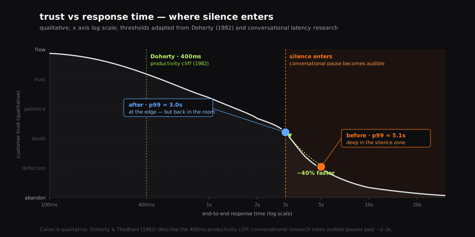
When we plot trust against response time, it does not slope down — it cliffs. The work was not about making the average user happier. It was about pulling the tail back across the silence threshold so the room kept breathing.
On profiling without ego
The hardest part of performance work is not the optimization. It is measuring something you suspect will embarrass you. Brendan Gregg's USE method [2] — utilization, saturation, errors, for every resource — does not care about your architecture diagram. It just asks: of every queue and every device on the path, which one is full, which one is waiting, which one is dropping things?
Most of our wins came from accepting an answer we did not want. CPU was the bottleneck, not the GPU we had been blaming. A buffer pool, not a model swap, was the biggest single improvement that quarter. The decoder was fine; the postprocess was quietly setting fire to the budget. None of this was glamorous, and exactly because it was not glamorous, it was real.
There is a temptation in AI work to keep reaching for the model lever. New backbone. New decoder. New attention variant. Sometimes that is right. More often, the lever you actually want is two layers below the model and one floor below your dignity.
When the bank ran the same workflow a month later, nobody counted seconds out loud. The product had not gotten more impressive. It had gotten more polite. That was the entire deliverable.
References
- [1]Dean, Barroso (2013). The Tail at Scale · Communications of the ACMWhy the long tail dominates user experience even when the average looks fine — and why fan-out systems amplify rare slowness into the common case.
- [2]Brendan Gregg (2020). Systems Performance: Enterprise and the Cloud (2nd Edition) · PearsonUSE method, flame graphs, and the discipline of profiling honestly before reaching for the next clever idea.
- [3]NVIDIA (2024). TensorRT-LLM Performance Best Practices · NVIDIA Developer DocumentationPractical levers for inference latency on GPU — graph compilation, KV-cache management, adaptive beam, and kernel fusion.
- [4]Dao, Fu, Ermon, Rudra, Re (2022). FlashAttention: Fast and Memory-Efficient Exact Attention with IO-Awareness · NeurIPS 2022Reformulates attention around memory IO — same math, dramatically less HBM traffic, often free latency on long sequences.
- [5]Hinton, Vinyals, Dean (2015). Distilling the Knowledge in a Neural Network · NeurIPS Deep Learning WorkshopTeach a smaller student to imitate a larger teacher's distribution — the canonical way to remove a model from your critical path without losing too much quality.
- [6]Microsoft (2019). ONNX Runtime: cross-platform, high-performance ML inferencing · Microsoft Open SourceA portable inference runtime that lets you stop paying for the framework you trained in once a graph is stable.
- [7]Doherty, Thadhani (1982). The Economic Value of Rapid Response Time (Doherty Threshold) · IBM Systems JournalThe classic 400ms productivity cliff — past this point, the human at the keyboard switches to a slower, more defensive mode.